COLORS
What color has to survive
A colorant does not fail on the bench. It fails somewhere between the mixer and the end of shelf life, and the place it fails tells you which pigment you should have picked.
Map the pigment against your process in this order.
Thermal load comes first. Published work on dry canine diets puts extrusion in the range of roughly 110 to 150 degrees Celsius, and a retort cycle is less violent but holds far longer. Most plant-derived pigments were never built for either. Anthocyanins, the reds and purples from sources like grape skin and purple carrot, break down under those conditions. Chlorophylls hold moderately. Carotenoids handle heat comparatively well. Caramel colors and mineral pigments come through more or less intact.
Time at temperature is the next question. Extrusion is brutal but brief. Retort is less violent and much longer. A pigment that survives one will not automatically survive the other, which is why a color that works in your kibble line can drop out of your wet product.
Then there is pH. Anthocyanins are pH-active by nature. If your system is acidified, a red can shift toward a muddy purple, and it will do it consistently and predictably once you know the working range. Buffering fixes it. Guessing does not.
Light is the one that shows up late. Turmeric fades. Beet fades. Caramel and carmine hold. In a clear window pack under retail lighting, that difference becomes visible fade inside the stated shelf life, long after the production run has shipped.
Oxygen and the fat system close the list. Pigments applied in a coating live in the fat. If the fat oxidizes, the color goes with it, and you can lose color and gain rancidity from the same root cause. Antioxidant systems in the coating protect both.
Natural colors in pet food are not selected by shade. They are selected by what the process does to them, then matched to shade within what is left.
The pigment families, and what each one actually does
Carotenoids cover yellow through orange to red: annatto, paprika oleoresin, beta-carotene. They handle heat comparatively well, which is what makes them workable in this category, and they are oil-soluble, which makes them a natural fit for a fat-based coating system. Their weakness is oxidation rather than temperature: they are sensitive to oxygen, light and metal ions, so the antioxidant system around them matters as much as the pigment choice. Paprika carries a flavor note of its own and can read bitter at higher dosages. This family does most of the work in the yellow-to-orange range.
Anthocyanins come from purple carrot, grape skin, red cabbage and black currant. They are the most attractive natural reds and purples on a swatch, and the least forgiving in a process: heat sensitive, light sensitive and pH sensitive at once. They belong in cold-processed and low-heat formats, not in a retort system and not through an extruder barrel.
Betalains come from beet, the most familiar natural red in the category and the most commonly mis-specified. Beet color is water soluble, bright, inexpensive relative to the alternatives, and heat sensitive. Beet has a real place in low-heat treats and coated applications. In a retort system it will not hold, and it is worth saying that early rather than after the first commercial run.
Chlorophylls give you green, from plant sources and from spirulina. They have moderate heat tolerance and poor light stability. If you need green to survive a bright shelf, plan on opaque packaging or expect fade.
Caramel colors are the workhorse for browns and meaty tones. They are made by controlled heating of carbohydrates, and produced in four classes that differ by what they are reacted with. Caramel is heat and pH stable, and already widely used across the category, which makes it the easiest entry point when a brand is moving off synthetics. The technical variable most people miss is that caramel carries a net ionic charge that varies by class, and it has to be matched to your system. Get the charge wrong against the charged proteins and tannins in your formula and you get haze or precipitation rather than color. Two of the four classes carry a compound that attracts regulatory attention in human food, which matters more for brand perception than for pet food compliance.
Mineral pigments are iron oxides in red, yellow and black. Mined and inorganic, they are about as stable as color gets, and they come through extrusion heat and retail lighting essentially untouched. The catch is not technical. Many brands positioned on "no artificial colors" will not accept them, so this is a decision that has to be made with the marketing and regulatory side before you develop a system around it.
Synthetic certified dyes are the stable benchmark. FD&C colors are stable across heat, light, pH and oxidation, they dose at a fraction of the rate of naturals, and they are cheaper in use. They are also being displaced across the category by retailer requirements and brand positioning rather than by any technical failure. Where a synthetic is still the right answer, we will say so. They carry two practical costs worth planning for: some of them stain stainless steel and rubber seals badly, which turns every changeover into a sanitation problem, and one of them is now on a regulatory clock in human food.
FD&C Red No. 3 deserves its own note. FDA revoked its authorization for use in human food and ingested drugs in January 2025, with a food reformulation deadline in January 2027. Pet and animal food fall under a separate color-additive regime and are not directly covered by that order. That distinction matters commercially: the pressure to move off Red 3 in pet food is coming from retailers, brand owners and cross-category label consistency, not from a compliance deadline. If you are planning a transition, you are choosing the timing rather than being handed one.

Powder, liquid, oleoresin, dispersion
Format decides handling, dosing accuracy and where the pigment can go in your line. It is a bigger lever than most specification conversations give it credit for.
Powders are shelf stable, easy to store, and easy to dose by weight. They are usually spray-dried onto a carrier, and that carrier comes with your color. If it is a starch-based carrier, your "natural color" is contributing carbohydrate to the formula. If you are building an allergen-restricted line, the carrier is the thing to check, not the pigment. Powders can also disperse poorly into a wet mix and form clumps, which is what speckling and mottling usually turn out to be.
Liquids disperse well and dose smoothly, and they bring water with them. In a semi-moist or high-moisture format, that water counts toward your water activity calculation, and enough of it will force a change to your drying or your extrusion moisture to stay shelf stable. Liquids also need to be considered for their own microbial stability in storage.
Oleoresins and oil dispersions are the right answer for coating systems. They suspend in the fat you are already applying, they cover evenly, and the oil itself shields the pigment. This is the format that makes post-extrusion coloring work properly.
Encapsulated and lipid-plated pigments put a physical barrier between the pigment and the moisture, heat and oxygen around it. They cost more. They are the answer when a water-soluble color would otherwise bleed out of a treat and stain the pack or the piece next to it in a mixed-format bag.
Where the color goes in matters more than which color you picked
This is the single largest lever available, and it is a process decision rather than a purchasing one.
Adding a sensitive pigment to the dry premix means sending it through the full heat and shear of the extruder barrel, where a good deal of it will not survive. Applying the same pigment in the coating drum after the die, suspended in the fat and palatant system you are already running, keeps it out of the hot zone entirely. Color retention improves, coverage is more even, and you generally get better visual impact at a lower inclusion rate than you would have needed in the barrel.
Two things follow from that.
The color you see on a piece of kibble is mostly surface. If your fat-to-pigment ratio is off, or the coating fat sets too quickly, the pigment does not anchor properly and it rubs off onto the bag and the customer's hands. That reads as a quality problem even though the color itself was fine.
And the base is not neutral. Your raw materials have their own color, and it moves with crop year and with formula changes. If your meal darkens because the grain fraction shifted, a constant colorant dose will still give you a different finished shade. Correcting the base before chasing the pigment saves a lot of trials.
The retort trap
Wet and pâté systems are the least forgiving environment in the category, and they catch people out because the failure is total rather than partial.
Beet is the default natural red almost everywhere, and it is the wrong choice for retort. Anthocyanin sources fail there too, and the published gap between them and the alternatives is wide. In a comparative study of natural red extracts held at 90 degrees Celsius for six hours, cochineal retained about 95 percent of its absorbance while elderberry retained roughly 64 percent, red cabbage 46 percent and hibiscus 27 percent. Those conditions are a laboratory model rather than your retort cycle, but the ranking holds and it is the ranking that decides the specification.
What comes through are the caramel colors and, where the brand permits them, the mineral pigments. Carmine covers similar ground to beet on shade with far better heat stability, and carries its own label considerations.
There is a second failure mode specific to gravy and sauce systems: if the pH of the medium moves, a pigment can strip out or precipitate rather than just shift shade, and it will take the visual quality of the gravy with it. That belongs in the same conversation as gel stability, because it is decided at the same point in the process. See our field note on gravy stability.
Shade matching, and why your dose should not be a fixed percentage
Natural colorants are agricultural products. A crop grown in a dry, bright season carries a different pigment concentration than the same crop from a wet one. The consequence is direct: if you dose a natural color at a fixed percentage of the batch, your finished color will drift with the harvest.
The fix is to dose against the measured color strength on that lot's certificate of analysis rather than against a fixed inclusion rate. That requires the certificate to actually carry the value, which is a specification question to settle before the first order rather than after the third one.
The rest of the discipline around it:
Set a master standard on a batch you are happy with, measured instrumentally rather than judged by eye, and hold production against a defined tolerance from it. The usual instrument is a color difference value, and the published perception scale gives you the bands to set that tolerance against: below about 1 the difference is imperceptible to the eye, 1 to 2 is detectable only under close inspection, and 3 or more is visible at a glance and is where consumer complaints start. The classic just-noticeable difference on the older formula sits at roughly 2.3. Specify which formula you are measuring on, because the current standard weights lightness, chroma and hue differently from the original and the two do not give the same number.
Run the light exposure test before you commit to packaging. If your color fades in a few days under high-intensity light, a clear window pack on a bright shelf will do the same thing more slowly and you will find out from a customer.
Dose by weight on a calibrated scale, never by volume. Natural colors are added at low enough levels that scoop-based dosing is the most common cause of day-to-day color drift, and the second most common is an operator deciding a batch looks light and adding a little more.
Test the pigment against your vitamin and mineral premix on the bench before you scale. Some pigments interact with trace minerals and give you gradual graying or darkening over shelf life, which looks like fade but is a different problem with a different fix.
Labeling, and why the Canadian rule should set your master formula
If you sell into both countries, write your ingredient deck to the stricter requirement and run one packaging specification.
The United States permits broader declarations. Canada does not accept a generic "color," and it does not accept "vegetable juice for color" as an umbrella over a pigment. The specific common name is required. A label built for the US market and shipped north gets flagged.
The practical consequence is small and worth doing early: declare the specific source, "paprika extract" or "turmeric," in the master formula from the start, and both markets are satisfied by one deck. Retrofitting this after artwork is approved is the expensive version.
Two related points. Carriers in a color preparation may need declaring depending on jurisdiction and on whether the carrier performs a technical function in the finished product, so ask your supplier for a written carrier statement rather than assuming.
And if you are carrying a "natural" claim, the color decision can end it. AAFCO defines natural as derived solely from plant, animal or mined sources, not produced by a chemically synthetic process, and not containing chemically synthetic additives beyond what good manufacturing practice might leave behind. Artificial colors are named on AAFCO's own list of things that do not fit that definition. There is one carve-out, and it is narrower than people assume: synthetic vitamins, minerals and trace nutrients are permitted, but the product then has to carry a qualifier along the lines of "natural with added vitamins, minerals and trace nutrients." Colors get no such carve-out. That is a formulation decision with a marketing consequence, and it is cheaper to make it on purpose than to discover it at artwork.
The honest trade-off
Natural colors cost more than synthetic dyes. They dose at higher rates, they are more sensitive to heat, light and pH, and they need more process attention and more testing to hold a consistent shade.
What you get is a label that supports the positioning most premium brands have already committed to, and in many cases a retail listing that would not be available otherwise. That is a real return, and it is worth being clear-eyed about what it costs to get it.
Two things make the transition cheaper than it looks. Caramel and malt-derived browns are already in wide use across the category and are the easiest place to start. And moving color application from the barrel to the coating step often recovers enough performance to make a natural work where it looked marginal on paper.
Where Calhu fits
We match color to your process rather than to a swatch, and we would rather have the awkward conversation about what will not hold before you commit than explain a fade after a production run.
What we need from you to be useful: the format, the thermal profile of the line, the pH of the finished system, the packaging, and the label constraints your brand or your retailer has set. With those five things, most of the range eliminates itself and the conversation gets specific quickly.
We work in powder and liquid formats, we shade match against your actual base rather than a target color chip, and where a synthetic is genuinely the right answer for your product we will tell you that too.
Tell us what you are coloring and what it has to survive.
Common questions
Will beet color survive retort?
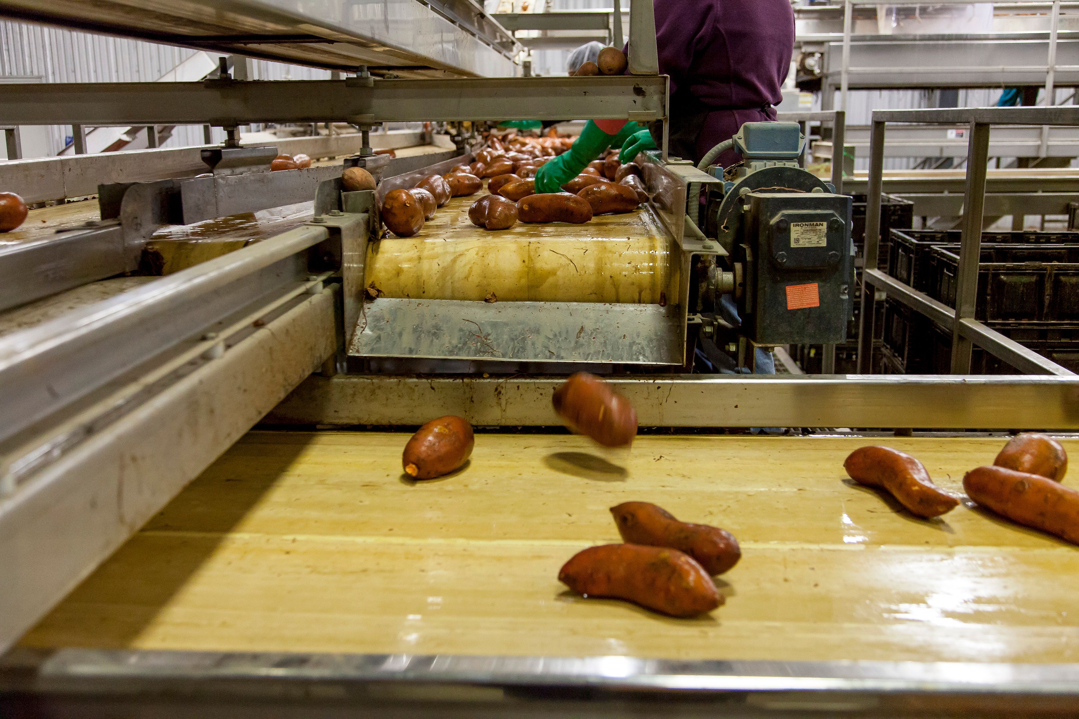
No. Beet is heat sensitive and will not hold through a retort cycle. It works in low-heat treats and coated applications. For a heat-stable natural red, carmine and purple sweet potato cover similar ground, and caramel colors handle the brown and meaty range.
Why is my kibble fading in the bag?
Almost always light. Turmeric and beet both fade under retail lighting, and a clear or translucent pack accelerates it. Switch to a more light-stable pigment, raise the antioxidant level in your coating system, or increase the opacity of the packaging.
Should color go into the premix or the coating?
The coating, for anything heat sensitive. Post-extrusion application keeps the pigment out of the hottest part of the process, gives more even coverage, and usually reaches the target shade at a lower inclusion rate than in-barrel addition would need.
Can I label a natural color as "vegetable juice for color" in Canada?
No. Canada requires the specific common name of the colorant. Build your master formula to declare the specific source and one ingredient deck will satisfy both the Canadian and US requirements.
Does the FDA Red 3 revocation apply to pet food?
The January 2025 order covers human food and ingested drugs, with a food compliance deadline in January 2027. Pet and animal food are regulated under a separate color-additive regime and are not directly covered by it. The pressure to move off Red 3 in pet food is commercial rather than regulatory, which means you control the timing.
Why does my color change between shipments when nothing else changed?
Natural pigments vary in strength by crop year and lot. Dose against the color strength value on each lot's certificate of analysis rather than a fixed percentage, and the drift largely disappears.
Are iron oxides natural?
They are mined mineral pigments, and they are exceptionally stable through both processing and shelf life. Whether they fit your product is a brand and label question rather than a technical one, and it is worth settling with your marketing and regulatory people before development starts.